mandag 11. februar 2013

Top 5

So as the title suggest, I'll put up what I believe to be my best pictures of the autumn semester, telling why I like them and what I did to achieve the composition. The order is set when during the semester they were taken, also I've focused on pictures not seen on the blog before. None has been edited in any way.


One of the first pictures I took. I quite like this because you get the deep contrast, the blurry background, all in all the feeling of nature this picture represent for me. I got this by laying down in the meadow with the light coming from behind the tree tops to the right. 


 I know what you're thinking... "Wasn't this supposed to be pictures you've taken?" But to your amazement I have taken this, with my pro photographer skills. I like this quite for the same reasons as picture #1, though here with a more... "wondrous"(?) feel to it, I guess. 

Contrast, contrast, thee be giving thy charm to my pictures. As you might have guessed by my pictures, I love 'em dark with a high contrast. The arch from the road gives the picture more dynamics, while the "wannabe cartoon mouse" cloud shines ever so brightly on the road.

I adore fire pictures, there's so much dynamic and interesting effects from placing your cold body in front of the stove with your trusty phone in your hand, snapping pictures while the flame is turning purple/pink.
This picture to me seems close to mystical, because of (without over thinking it) the different shades of fire, possibly caused by ink, paper or cover. I chose to take a close up to get the focus on the book as well as the flames. This might also have been a better Christmas card picture towards the other assignment, because it's... Cosy.


Last picture, another dark one. Snowy forest, the sun hidden by the "mountains" of trees and the feeling of cold. This picture I got while walking back after trying really hard to get a "cosy" Christmas card base for another project, since I like the blue, cold colours. Though this is what winter represent's to me, it's not the common interpretation of Christmas.

mandag 4. februar 2013

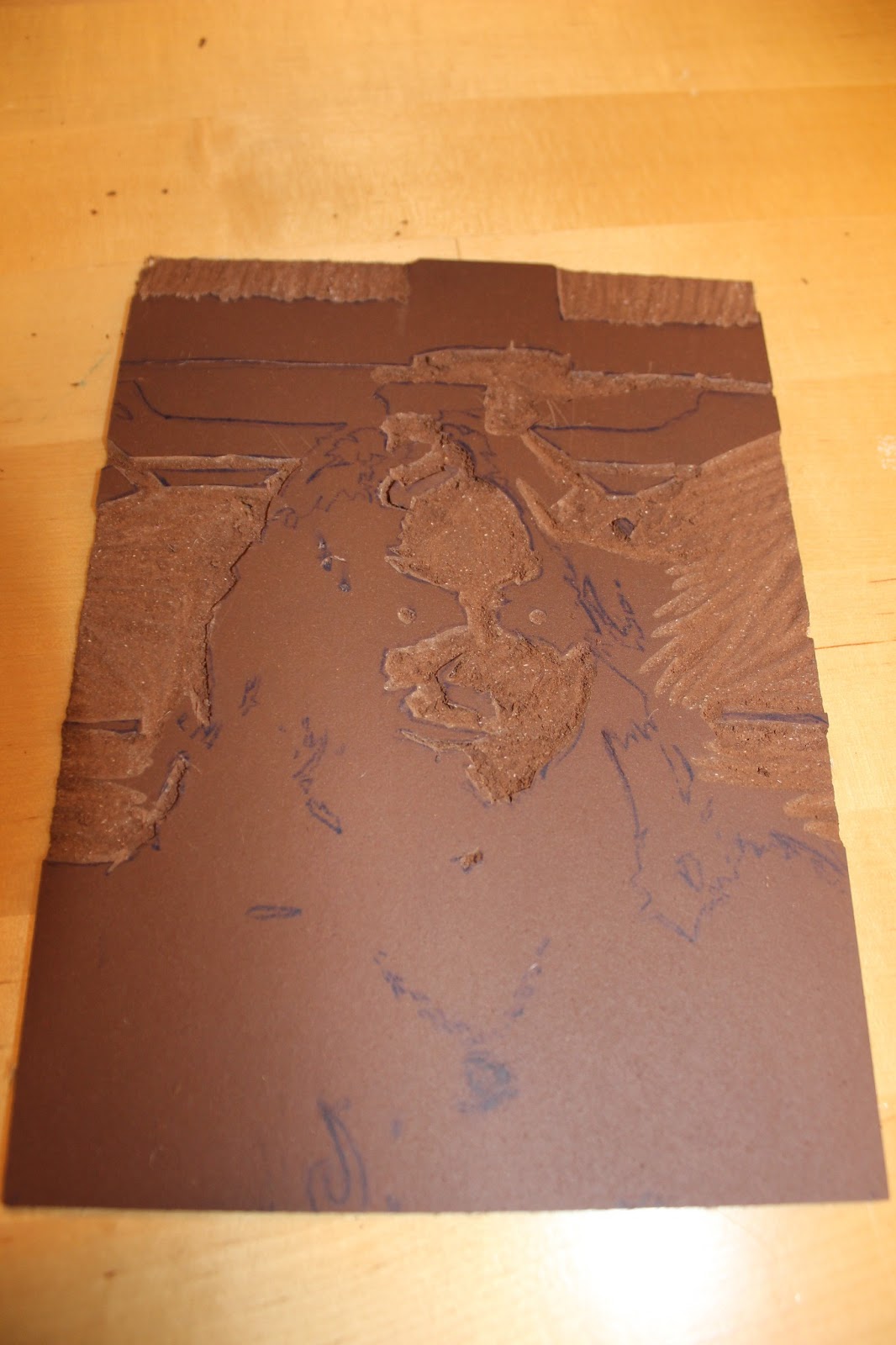
Carving the Edges

 
 This time we were told to carve out a threshold picture of ourselves in lino. Since the light source is coming artificially from above and naturally from the right side of the photo, the shadows came out like this, much to my liking. I picked this picture out of the others mainly out of the expression it had.
 Now here came the tricky part; How the  kittens am I going to carve all those fine details?  I cant't find my scalpel anywhere, so I would have to settle with the school supplies.
Here I'm obviously halfway through.
I kept getting this feeling something would go wrong, and it did; My hairline got loose, I lost part of my nose and my mouth and my face got rounder. 

 Personally I prefer the one on the left, it's more interesting in the print than the one on the right. Though towards the assignment I chose the right one, since we are supposed to mass produce the print, and the distortion in the left one is not possible to recreate.

tirsdag 8. januar 2013

Reflections and Curls

 So here I'm at it again, with this pro moth-chilling-on-a-mirror shot. I actually like it, which is rare in my chase. The background may be somewhat unfortunate, though still interesting. Considering it's also blurry, no focus is taken away from the main object; Le moth.
The following pictures are affiliated with a most skilfully task; Overview, close and detail. As often seen, my co-photoperson (http://norgreeklishashley.blogspot.no/) is modelling. 

 Overview shot


 Close up
Detail

mandag 7. januar 2013

Once upon a filter

Filters, filters, filters.... We used them.

For this picture, I used "Stamped" for skin and hair, "Watercolour" for the sweater, and "Sumi-e" for a portion of the background surrounding my model. Also I added some colouring and highlight to the eyes of the owl earring for more depth... No apparent reason.


Here is yours truly, with the background filtered with "Dark strokes" and myself with "Poster Edges". I like the composition, it does somewhat reflect me.

Here I just used "Torn Edges" for a more complete and simple photo. All the cloaked people are me, this is a photo collage made earlier.

Lines, the early works of a person which would be me

I seem to have forgotten to upload this little project for some reason, until obviously now... 
We were to find vertical, horizontal and diagonal lines in different settings, as well as an S line. So.. Here's the pictures or whatever.


The first picture shows the branches,
diagonally.


Second one shows an S line, because of the leaf covered road.

Last one you may see as "cheating", because both vertical and horizontal lines are in this picture. The vertical damage marks on the stairs, the horizontal and also diagonal planks and to have a solely horizontal object, the brick thing in the far end. 

tirsdag 11. desember 2012

Happy Yule, people

Yes, I am aware that it's early, but we had to make Christmas cards and kittens, so here I am.. Posting my version of one of those cards you don't really send to someone. 
For this composition I've merged two images, taken on a different moment and place of the day. The darker left corner has gotten the sunshine moved, because I erased the rest to make place for my winter wonderland... Increased the contrast as usual, slightly dubbed the blue (because mah teacher told me, though I feel the blue fits perfectly) and I can't remember the rest.. It's pretty much a sub-concious routine.

fredag 30. november 2012

Medieval promoting Poster


So for this assignment our teacher wanted us to make a poster showing off the medieval aspects of Bergen, but making it appealing to the youth. In this mash up I have four pictures, one being the base, and the rest going as a spiral from the vanishing point. I used the layer options Multiply and Overlay to get the desired effect, afterwards enhancing the already blue filtered pictures. The font is custom made, with a cold burgundy undertone. I used the settings Drop Shadow and Stroke to make the text easier to read.