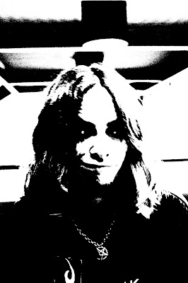
fredag 24. mai 2013

CD Cover


As preparation for a possible exam in photography, we had to create two CD covers for a genre of our choosing. The first task was to create one with at least one instrument and one person. As you may see, this is the second one, which we were allowed to do whatever. 
The "band" I made a cover for is called Serendipity, which is a symphonic metal band with folk elements. (And yes, I made all this up.)

Here I merged two images, "Poster Edged" the girl, created runny mascara with a soft brush and "Blur", as well as using "Burn" on her left eye. The background is merely with higher contrast and brightness.
Font is "FairyDust".


tirsdag 14. mai 2013

Drypoint (Koldnålsradering)


Drypoint is a printmaking technique, in which an image is incised into a plate with a needle. 

We were to find scenarios of which lines were prominent.


We used oil based paint and tried to rub it down in the "cracks". This became my result. (Right) I'm not quite happy with it since some of the lines aren't that clear. It does look slightly weird.

Advertisement

Ok.. So we were to make advertisements for something, anything really, and use techniques we've learned to create the elements that are in an advertisement. The idea is to advertise for reading, as it is possible to live through the main character through the words.

For this I did a collage of a screen shot of one of my characters, as well as a picture of a frequent model on this blog. 
Picture to the left is a two layered, with the lower being "posterized" and the above reduced to 13 % opacity. The eager reader is between these two, where I used "refine edges" to remove the unimportant background and merge the elements.
The text is first "Fairydust" and then "Metal Macabre". The last one flowing over the shield of the cartoon character. The eyes of the model looks at the book, but as you follow her eyes you get to the text.


Dead Silence

 The theme is as the title suggest, silence. For this assignment I asked a friend of mine to join me at a graveyard for a little photo shoot. All the photos had their saturation lowered to create a more gentle and soft feel. 

The model were to interact with the environment as gracefully and "silent" as to compliment the surroundings, and create a complete look which appears muffled.
 Towards the theme, I instantly thought of a graveyard because what's more silent than the last resting place?

Considering that it was quite windy at that time, I feel we were lucky to catch those moments when her hair and dress stood still, as a dynamic picture would disturb the message.


fredag 8. mars 2013

Reenactment

So for this assignment, we had to re-enact a painting, illustration or a text using a camera and PS.

I chose the delve in the art of Victoria Francés, my favourite illustrator. The one I chose is featured in Francé's first book in the Favole series, Gelida Luz. Which officially is translated to Frozen Light. Francés' art has a gothic feel to it, which I tried to create using some props.


On the model I've dyed her hair red,coloured her lips, darkened her lids with the burn tool.


Characteristic tears in Francé's art using a soft brush and the blur tool. Higher contrast, warming filter and lower brightness as usual. Also I took the frame from the original, and burned the edges.

The unedited picture:
f/ 3.5, Shutter: 1/25, ISO-320

torsdag 7. mars 2013

Piece of History

Arthur Fellig (Weegee) is a well known (Though I did not know of him until now) photographer and photojournalist during the 20's-60's. His signature photos were his street photographies.
He worked in New York taking pictures for the news paper, featuring crime scenes and various other action photos.
 Though Weegee did not only do action photographies, he also had a photo collection featuring circus people and nudes.
Characteristic for Fellig, is that most of his shoots are during night time, where a dramatic contrast occur when using a flash. I am not sure if this is intentional, though it's something. He also took portraits, here of Marilyn Monroe puckering up.

fredag 15. februar 2013

Illusion of Frost and Snow

Our next quest, given to us by Duchess Teacher were to create the illusion of ice to confuse the villagers.
Do not be alarmed, the first two are actual ice. Chill dudes.... You see what I did there? The first two are taken with my cellphone camera.


The first picture shows a vast landscape of ice, with a soft curve around a mountain. The flakes does give away it's not real, but since there are no other objects revealing the actual size of the objects, it's sort of believable. 


Made with the help of my partner in crime's legs, I got to enhance the wave effect so to me, it looks like a frozen tsunami. The light through the ice gives it the feeling that it's a clear wave.

Now to begin the summoning of the illusion.
"Cast: Awesome photo skills"

 Look at mah caves.
If you tilt your head to the right, or just turn your laptop towards the right, you'll see how it actually looks. Though I feel it's more interesting with this angle.
The reason for that is the spiral effect   in the bottom half is enhanced, though It may not look like ice, but I find it pleasing.
 My favourite. To me this is perfect, you have the reflection, the water dripping from the cave side, and the light is not that extreme. Also, the shadow in the background to the left does sort of look like a guy in a boat.
Aaaand a mixture of both.
Real ice: Multiply layer prosperity, Cooling filter, Higher contrast and lower lighting
Fake: Overlay, Red filter, Higher contrast and lower lighting.


mandag 11. februar 2013

Top 5

So as the title suggest, I'll put up what I believe to be my best pictures of the autumn semester, telling why I like them and what I did to achieve the composition. The order is set when during the semester they were taken, also I've focused on pictures not seen on the blog before. None has been edited in any way.


One of the first pictures I took. I quite like this because you get the deep contrast, the blurry background, all in all the feeling of nature this picture represent for me. I got this by laying down in the meadow with the light coming from behind the tree tops to the right. 


 I know what you're thinking... "Wasn't this supposed to be pictures you've taken?" But to your amazement I have taken this, with my pro photographer skills. I like this quite for the same reasons as picture #1, though here with a more... "wondrous"(?) feel to it, I guess. 

Contrast, contrast, thee be giving thy charm to my pictures. As you might have guessed by my pictures, I love 'em dark with a high contrast. The arch from the road gives the picture more dynamics, while the "wannabe cartoon mouse" cloud shines ever so brightly on the road.

I adore fire pictures, there's so much dynamic and interesting effects from placing your cold body in front of the stove with your trusty phone in your hand, snapping pictures while the flame is turning purple/pink.
This picture to me seems close to mystical, because of (without over thinking it) the different shades of fire, possibly caused by ink, paper or cover. I chose to take a close up to get the focus on the book as well as the flames. This might also have been a better Christmas card picture towards the other assignment, because it's... Cosy.


Last picture, another dark one. Snowy forest, the sun hidden by the "mountains" of trees and the feeling of cold. This picture I got while walking back after trying really hard to get a "cosy" Christmas card base for another project, since I like the blue, cold colours. Though this is what winter represent's to me, it's not the common interpretation of Christmas.

mandag 4. februar 2013

Carving the Edges

 
 This time we were told to carve out a threshold picture of ourselves in lino. Since the light source is coming artificially from above and naturally from the right side of the photo, the shadows came out like this, much to my liking. I picked this picture out of the others mainly out of the expression it had.
 Now here came the tricky part; How the  kittens am I going to carve all those fine details?  I cant't find my scalpel anywhere, so I would have to settle with the school supplies.
Here I'm obviously halfway through.
I kept getting this feeling something would go wrong, and it did; My hairline got loose, I lost part of my nose and my mouth and my face got rounder. 

 Personally I prefer the one on the left, it's more interesting in the print than the one on the right. Though towards the assignment I chose the right one, since we are supposed to mass produce the print, and the distortion in the left one is not possible to recreate.

tirsdag 8. januar 2013

Reflections and Curls

 So here I'm at it again, with this pro moth-chilling-on-a-mirror shot. I actually like it, which is rare in my chase. The background may be somewhat unfortunate, though still interesting. Considering it's also blurry, no focus is taken away from the main object; Le moth.
The following pictures are affiliated with a most skilfully task; Overview, close and detail. As often seen, my co-photoperson (http://norgreeklishashley.blogspot.no/) is modelling. 

 Overview shot


 Close up
Detail

mandag 7. januar 2013

Once upon a filter

Filters, filters, filters.... We used them.

For this picture, I used "Stamped" for skin and hair, "Watercolour" for the sweater, and "Sumi-e" for a portion of the background surrounding my model. Also I added some colouring and highlight to the eyes of the owl earring for more depth... No apparent reason.


Here is yours truly, with the background filtered with "Dark strokes" and myself with "Poster Edges". I like the composition, it does somewhat reflect me.

Here I just used "Torn Edges" for a more complete and simple photo. All the cloaked people are me, this is a photo collage made earlier.

Lines, the early works of a person which would be me

I seem to have forgotten to upload this little project for some reason, until obviously now... 
We were to find vertical, horizontal and diagonal lines in different settings, as well as an S line. So.. Here's the pictures or whatever.


The first picture shows the branches,
diagonally.


Second one shows an S line, because of the leaf covered road.

Last one you may see as "cheating", because both vertical and horizontal lines are in this picture. The vertical damage marks on the stairs, the horizontal and also diagonal planks and to have a solely horizontal object, the brick thing in the far end.